In the contemporary culinary landscape, the visual aspect of food has become as important as its taste. Beyond geometric composition, symmetry, and minimalist presentation, color has emerged as a powerful tool in food design. Increasingly, chefs and food designers are using bold, contrasting, and harmonious colors to transform a dish into a visual experience, turning each plate into an artwork that engages diners’ eyes before their palates. This careful use of color, often referred to as culinary color design, not only enhances visual appeal but also influences perception of taste, quality, and overall dining satisfaction.
This article explores the role of color in modern cuisine, examining how chefs leverage color theory, contrast, and cultural associations to create visually striking dishes. We will discuss techniques used in plating, the psychological impact of colors on diners, the interplay of natural and artificial pigments, and the integration of vibrant colors into fine dining and casual gastronomy.
1. The Historical Context of Color in Culinary Arts
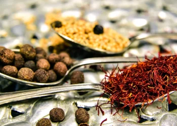
Historically, the emphasis on food presentation was often limited to form, texture, and arrangement. Color was typically a secondary consideration, naturally arising from the ingredients themselves. Traditional cuisines—whether Chinese, Italian, French, or Middle Eastern—used color primarily for nutritional and flavor balance rather than visual impact. For example, the inclusion of red peppers, green herbs, or yellow saffron served practical purposes while coincidentally enhancing a dish’s visual appeal.
With the advent of haute cuisine in 19th-century France, chefs began paying closer attention to plating and aesthetics, though color choices were still largely dictated by seasonal ingredients. It was not until the late 20th century, with the rise of modernist cuisine and molecular gastronomy, that color became a deliberate tool for creating a sensory experience. Chefs began experimenting with edible dyes, microgreens, and unconventional ingredients to produce dishes with vivid, eye-catching hues.
The contemporary culinary scene now places color on par with flavor, with chefs designing plates that deliberately contrast complementary colors, highlight vibrant accents, and even evoke emotional responses in diners.
2. The Science and Psychology of Color in Food
Color has a profound effect on human perception. Studies in sensory science have shown that diners’ expectations and perceptions of flavor are significantly influenced by the colors on their plate. For example, red is often associated with sweetness and ripeness, green with freshness and naturalness, and yellow with tanginess or zest.
Color Theory in Culinary Applications
Chefs often apply principles from traditional color theory in visual arts to the culinary world:
- Complementary Colors: Colors opposite each other on the color wheel (e.g., red and green, blue and orange) create strong visual contrast and dynamic energy on the plate.
- Analogous Colors: Colors adjacent on the wheel (e.g., yellow, yellow-orange, and orange) provide harmony and smooth transitions.
- Triadic Color Schemes: Using three evenly spaced colors (e.g., red, blue, and yellow) creates a vibrant, balanced effect that captures attention.
By understanding these principles, chefs can design plates that are visually stimulating without overwhelming the diner. Bold color choices guide the eye, draw attention to focal ingredients, and create balance and rhythm in the presentation.
Psychological Impact
Color can evoke emotions and influence appetite. Warm colors such as red, orange, and yellow tend to stimulate hunger and energy, while cool colors like blue and violet are often perceived as calming or rare in nature, affecting flavor expectations. Designers harness these psychological effects to enhance the dining experience. For instance, a dish plated with contrasting warm colors may feel more dynamic and exciting, whereas dishes emphasizing cooler shades may convey elegance and sophistication.
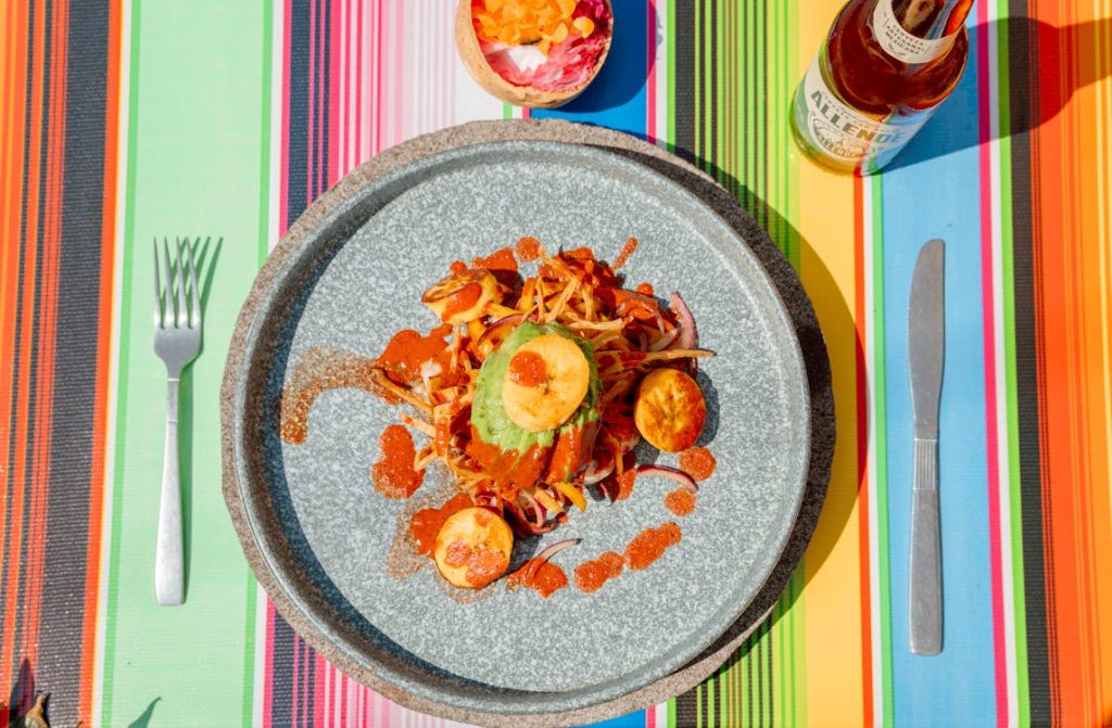
3. Techniques for Incorporating Bold Colors
Modern chefs use several techniques to incorporate bold colors into food presentation effectively:
3.1. Natural Ingredients
One of the most popular methods is to use ingredients with naturally vibrant colors:
- Vegetables: Beets, carrots, purple cauliflower, bell peppers, and microgreens provide strong visual contrasts.
- Fruits: Berries, pomegranates, citrus, and tropical fruits like dragon fruit add bright, natural accents.
- Edible Flowers: Nasturtiums, pansies, and violets are used for delicate splashes of color, enhancing both presentation and aromatics.
The advantage of natural ingredients is that they maintain both flavor integrity and nutritional value while producing visually striking effects.
3.2. Sauces and Purees
Chefs often use purees, reductions, and coulis to introduce bold colors and artistic patterns. Techniques include:
- Dotting or Drizzling: Small drops or streaks of vibrant sauces create contrast and highlight focal points.
- Smearing: A single swipe of puree across a plate creates movement and flow while introducing a bold color.
- Layering: Alternating layers of differently colored sauces can form a visually appealing gradient or geometric effect.
3.3. Molecular Gastronomy
Modernist cuisine allows for unprecedented manipulation of color:
- Spherification: Liquids are turned into colorful spheres that pop with flavor and visual intrigue.
- Foams and Airs: Light, airy foams in vivid colors can float above the plate, creating a multi-dimensional visual effect.
- Powders and Crystals: Freeze-dried fruit powders or colored sugar crystals can be sprinkled for added contrast and texture.
These techniques enable chefs to go beyond traditional colors and explore innovative visual designs that surprise and delight diners.
4. Color Harmony and Plate Composition
Bold colors alone are not sufficient; they must be integrated into harmonious compositions. Just as in art, the arrangement of colors on the plate determines the overall visual impact.
4.1. Focal Points
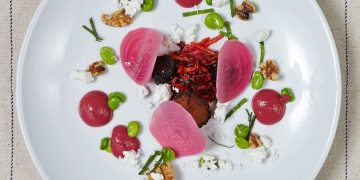
Bright or contrasting colors are often used to create focal points, guiding the diner’s eye to the main ingredient. For instance, a vibrant red beet puree under a golden seared scallop draws immediate attention to the protein, emphasizing its importance.
4.2. Layering and Depth
By layering ingredients with different colors, chefs create depth and perspective. A dish may feature a muted base color, with mid-tones in the middle layer and a vivid accent on top. This approach gives the plate dimension and visual interest.
4.3. Negative Space
Strategic use of negative space is essential in color-driven plating. Empty space around bold-colored elements prevents the plate from appearing cluttered and allows colors to pop naturally. Minimalist designs with bold colors can therefore create a clean, sophisticated aesthetic that draws the eye without overwhelming the senses.
5. Cultural Significance of Color in Cuisine
Color also carries cultural and symbolic meanings, which chefs leverage to enhance the storytelling aspect of a dish:
- Red: Luck and prosperity in Chinese cuisine; passion and richness in Western fine dining.
- Green: Health, freshness, and sustainability in many global cuisines.
- Yellow/Gold: Luxury, warmth, and indulgence.
- Purple: Rarity, elegance, and creativity, often associated with gourmet ingredients like purple potatoes or lavender.
By incorporating culturally meaningful colors, chefs can communicate a dish’s narrative or origin visually, enhancing both aesthetic appeal and emotional resonance.
6. Color in Fine Dining vs. Casual Gastronomy
6.1. Fine Dining
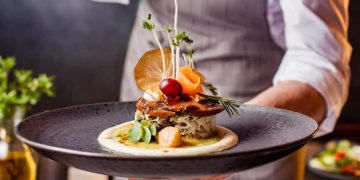
In fine dining, chefs often use bold colors sparingly and strategically to maintain elegance. The goal is to create visual refinement, where each color serves a purpose and reinforces the plate’s overall composition.
- Example: A white plate with muted protein tones, a single vivid beet puree, and a microgreen garnish creates a sophisticated contrast.
- Advanced techniques may include color layering, edible gold accents, or subtle gradients for a luxurious, multi-dimensional effect.
6.2. Casual and Experimental Dining
In more casual or experimental contexts, chefs may use brighter, more exaggerated colors to create excitement and encourage social media sharing.
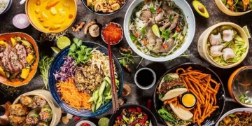
- Example: Rainbow-colored desserts, neon foams, or multi-colored vegetable bowls can be playful, energetic, and engaging, appealing especially to younger audiences.
Both approaches demonstrate that color is not just decoration—it is a central element of culinary communication, influencing perception, emotion, and engagement.
7. Trends and Future Directions
As culinary arts continue to evolve, color design is becoming increasingly experimental:
- Color Pairing Algorithms: Some chefs use software to select harmonious color combinations based on contrast, saturation, and hue.
- Edible Color Printing: Advances in edible inks allow for precise, colorful patterns on chocolate, sauces, or thin films.
- Seasonal and Sustainable Colors: Chefs are exploring natural dyes from seasonal produce, algae, and even edible flowers to reduce artificial coloring.
The integration of science, art, and sustainability ensures that color will remain a dynamic and evolving aspect of modern cuisine.
8. Conclusion
Color in culinary design is far more than a superficial addition. Bold, deliberate use of color enhances visual appeal, communicates cultural meaning, influences perception of flavor, and elevates the dining experience. By combining color theory, psychology, and artistic composition, chefs and food designers transform dishes into multi-sensory experiences, where each plate tells a story before the first bite.
As modern gastronomy continues to innovate, color will remain a powerful tool in creating memorable, aesthetically stunning, and emotionally resonant culinary experiences. Whether in the refined elegance of a fine dining restaurant or the playful creativity of casual eateries, bold colors are shaping the future of food presentation, turning every dish into a canvas of visual delight.
